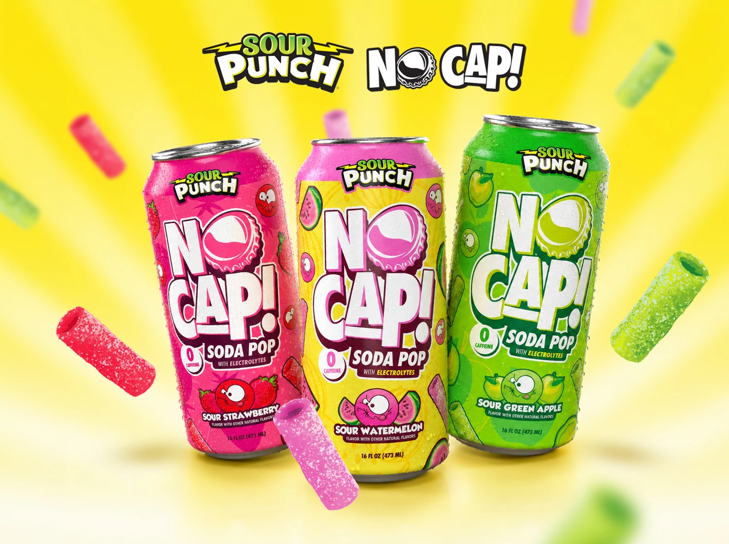
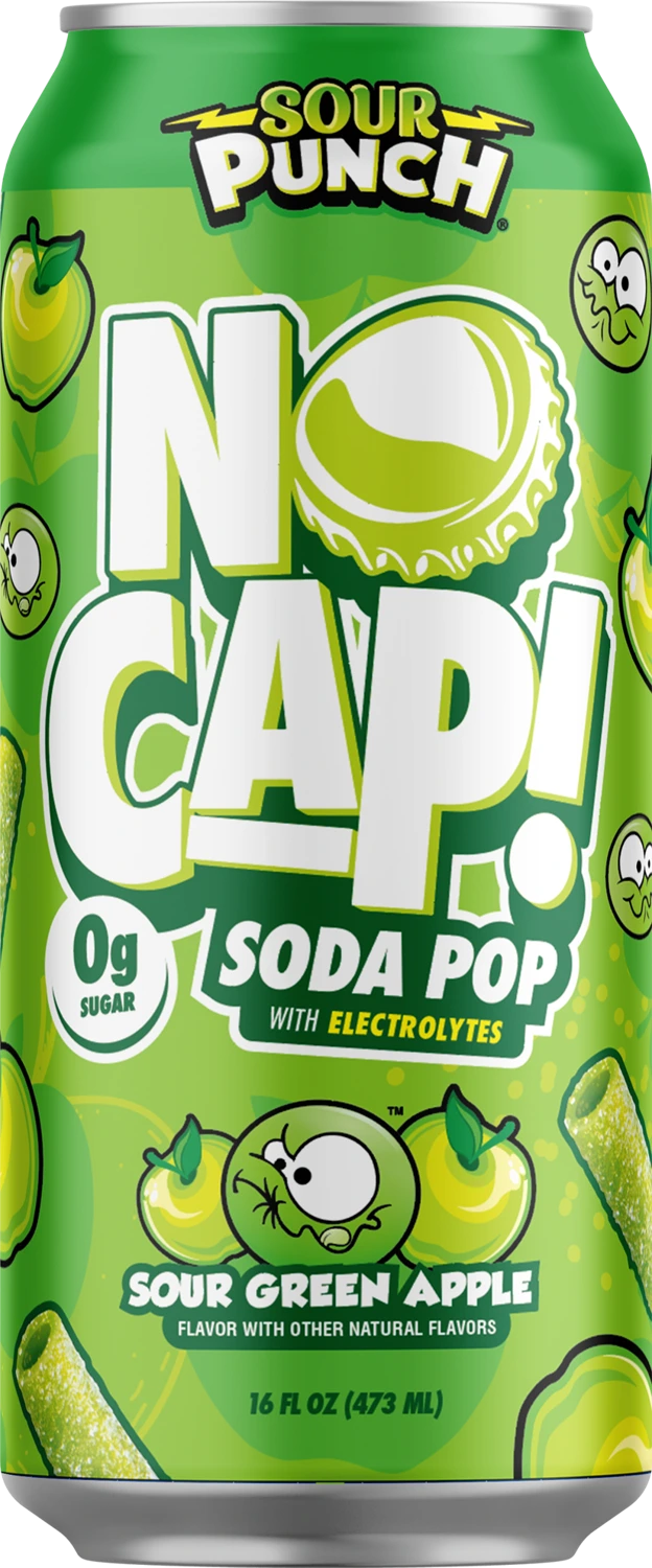
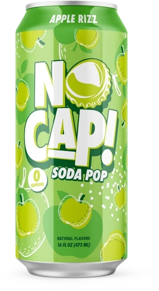
 Sour Green Apple
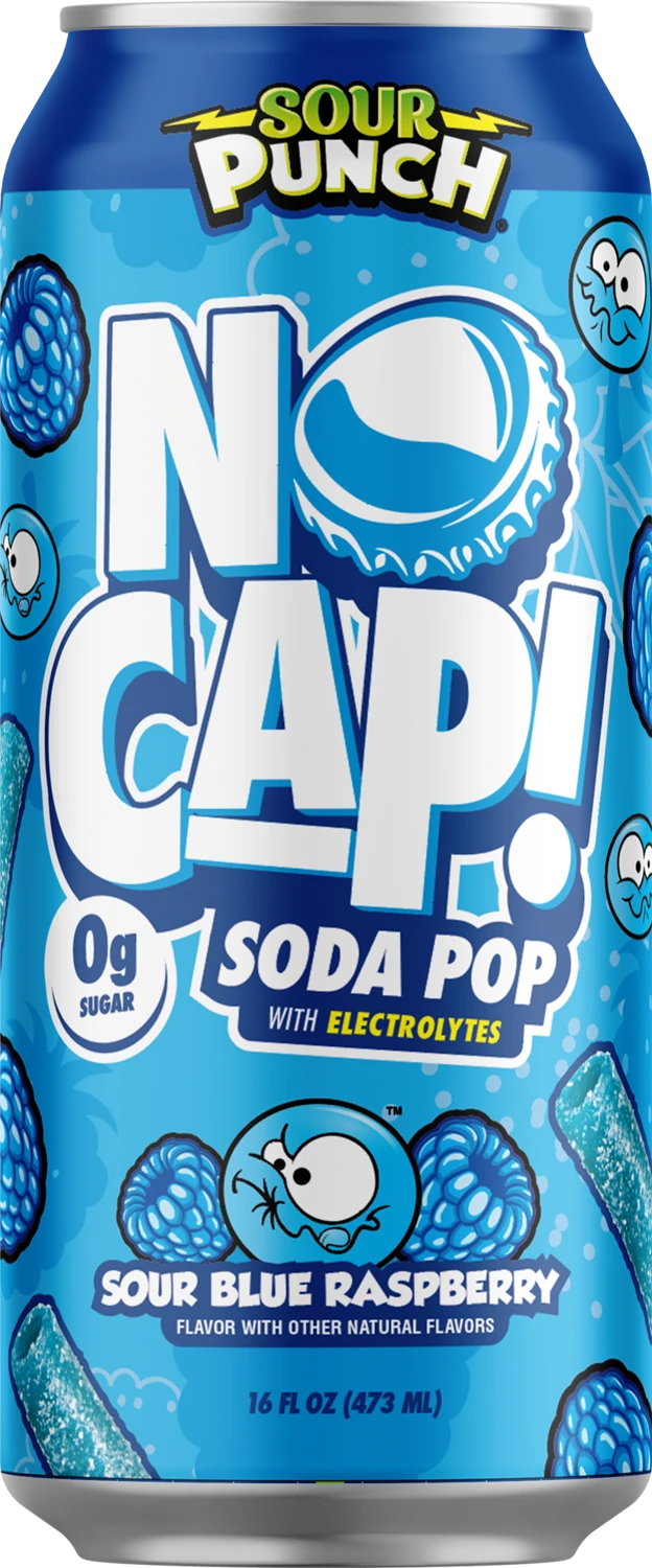 Sour Blue Raspberry
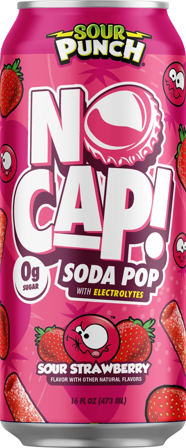 Sour Strawberry
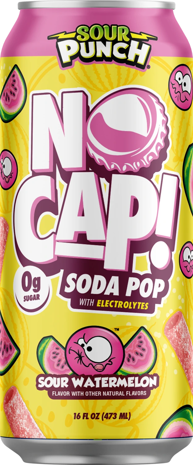 Sour Watermelon
 THE BRAND PLAYBOOKGet the assets ↗
The brand playbook. Built for maximum pop.
The bottle cap and exclamation point are part of the signature. Use the original artwork as a complete unit.
Give the NO CAP signature enough scale to be recognized at a glance. Keep its original outline, cap symbol, and Soda Pop lockup.
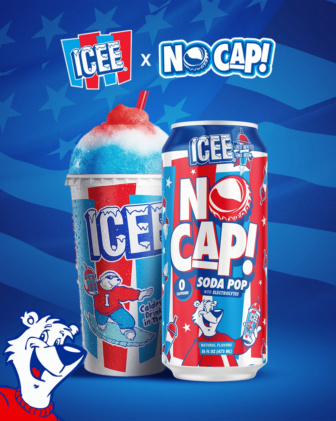
Use the supplied co-branded can and campaign artwork. Preserve the partner signature and its relationship to NO CAP.
White lettering, a dark keyline, and vivid color create the impact. Avoid faded backgrounds and low-contrast logo treatments.
Use the supplied logo with its original proportions. Choose the flavor-matched artwork or a monochrome signature on a simple, contrasting background.
Keep a minimum of one-quarter of the logo’s height clear on every side. For this digital guide, start at 120 px wide for stacked logos and 160 px for horizontal logos; increase until every detail reads clearly.
Keep the original proportions.
Keep the signature upright.
Preserve full opacity and contrast.
Lead with the yellow and blue contrast from the latest direction. Use white to separate the two worlds, then bring flavor-specific colors in through the cans and graphics.
Proposed screen palette based on the latest visual direction. Click any color to copy.
Click a swatch to copy its HEX value.
#181818#FFFFFFCore flavor values are sampled from the supplied logo and fruit artwork. Campaign values are proposed screen approximations of the supplied direction, not master print colors. For packaging, use the production artwork’s embedded color definitions and an approved printer proof; do not convert these HEX values into an assumed Pantone match.
A clean sans serif gives the loud stuff room to shine. Keep longer copy short, direct, and easy to scan.
ABCDEFGHIJKLMNOPQRSTUVWXYZ
abcdefghijklmnopqrstuvwxyz
0123456789 & ! ?
Use short phrases, large type, and a clear hierarchy. Keep display lettering to headlines, never long paragraphs.
Do not retype or reconstruct the NO CAP signature. This web typography recommendation is separate from the lettering and fonts in the original packaging files.
Put the collaboration cans up front. Keep the full label visible, use a strong sense of scale, and let each range own its color world.

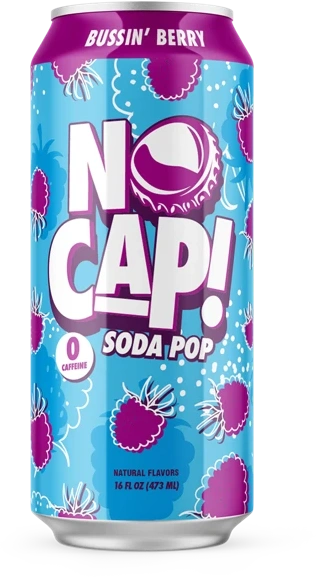

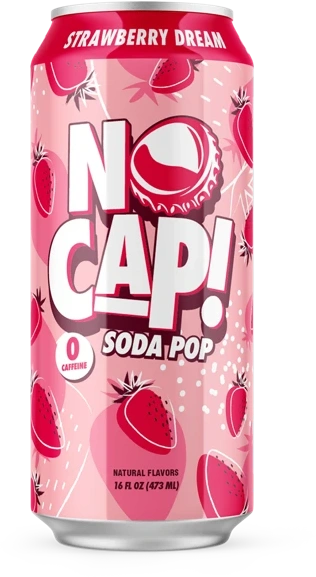
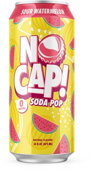
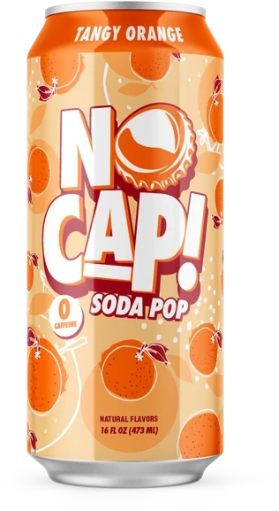
Show the front panel clearly. Keep proportions and flavor names intact. Give the can enough contrast against the background; avoid covering the logo with headlines or badges.
These supplied renders are visual references, not a release list or print-ready packaging. Match the current approved SKU artwork before producing sales or packaging materials. Co-branded ranges need their own partner artwork.
Use candy pieces, frozen textures, dramatic scale, and saturated lighting from the supplied campaign artwork. Product should feel dimensional, with one clear focal point and room for the signatures.
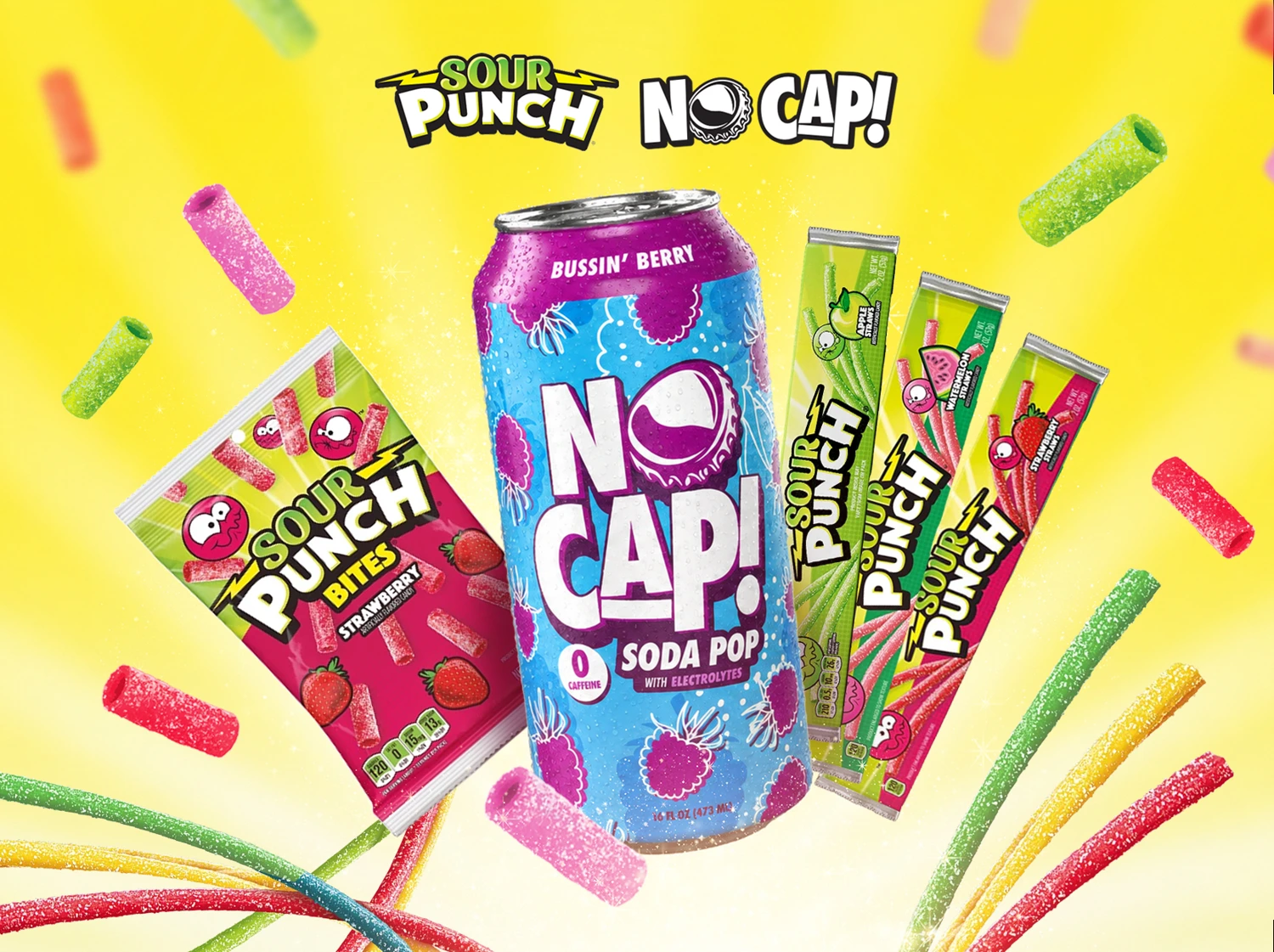
Yellow space, floating flavor cues, and playful product scale.
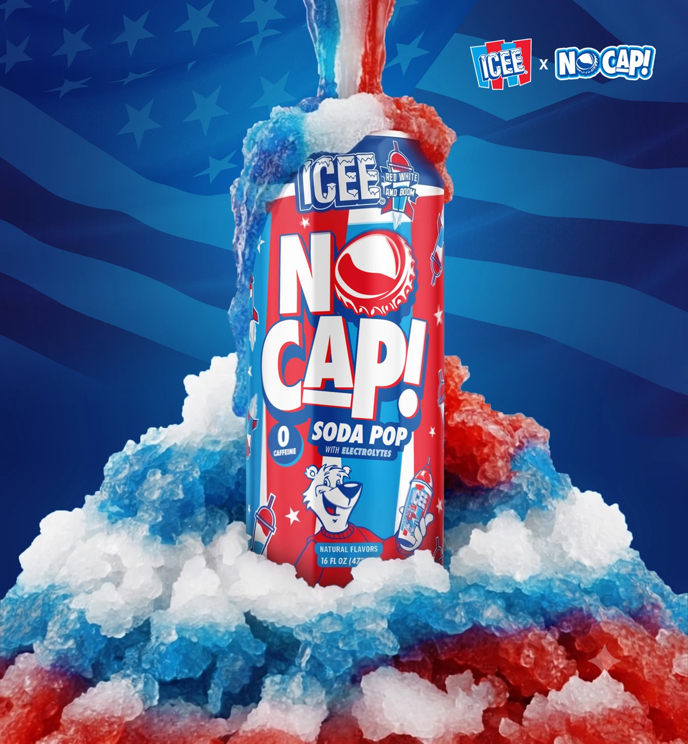
Blue depth, icy texture, bright highlights, and cold refreshment.
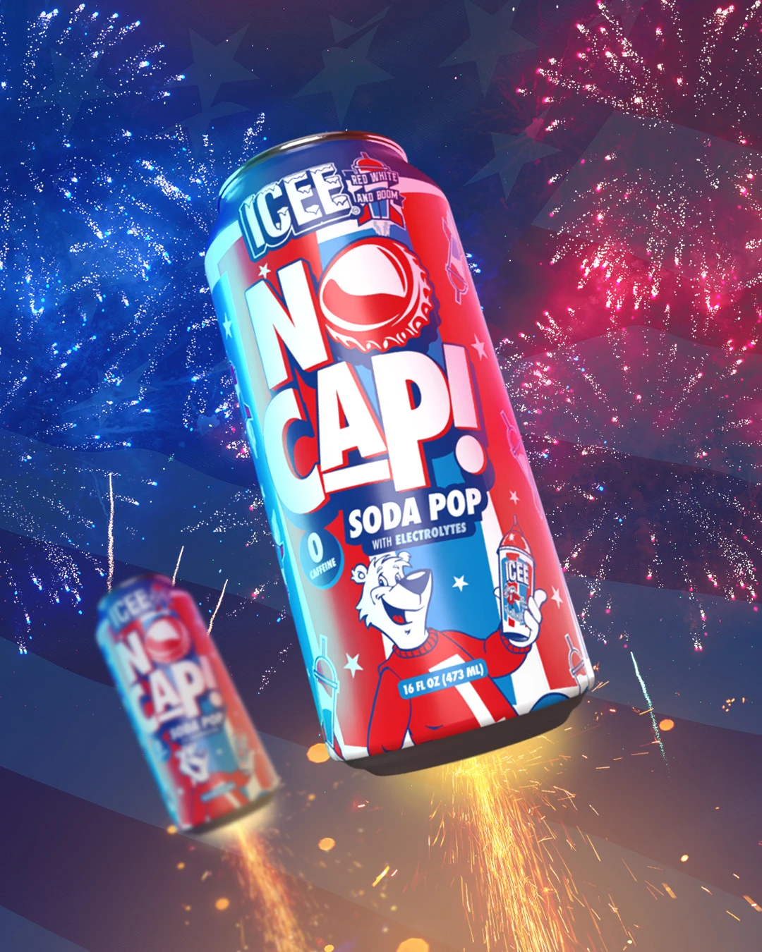
Diagonal composition and directional light keep the product moving.
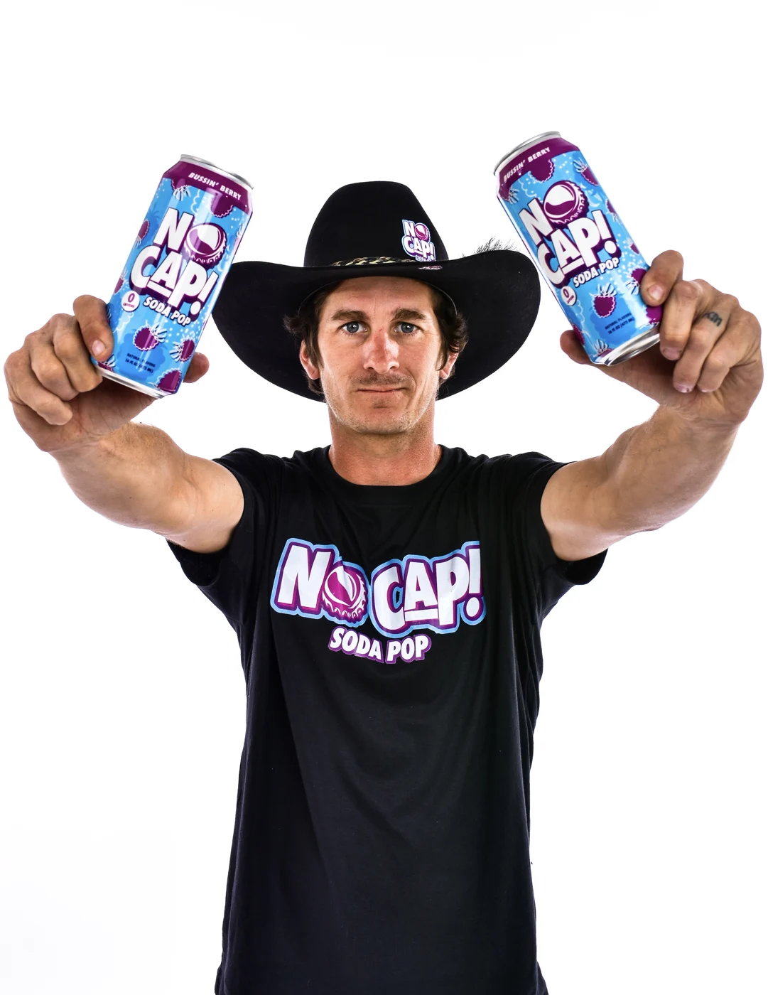
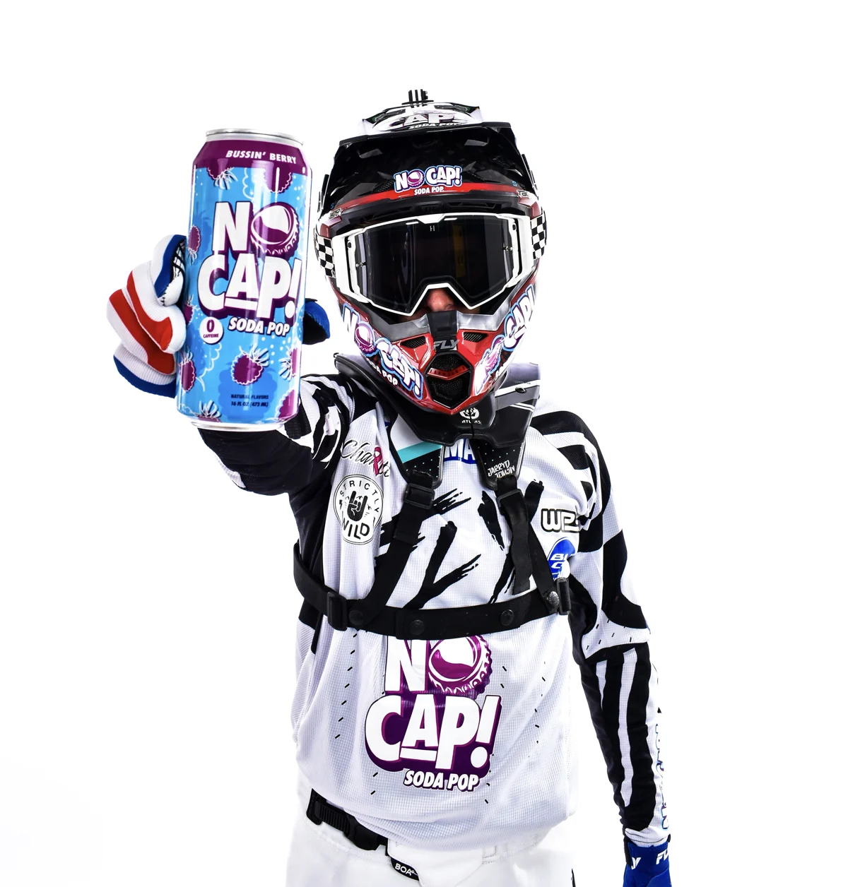
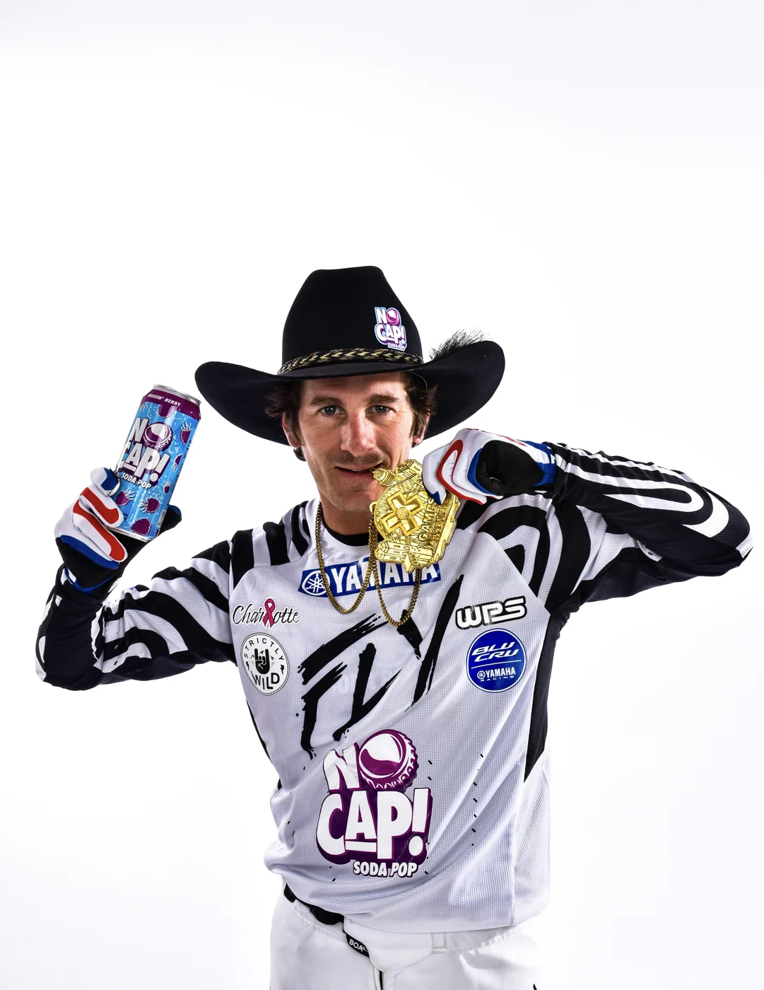
Original logos, core and collaboration can renders, and the source vector masters in one place.
This edition follows the latest supplied Sour Punch × ICEE visual direction and uses original NO CAP campaign artwork and photography. Clear space, minimum sizes, web typography, and layout guidance are proposed standards for this edition. They do not replace approved packaging specifications or confirm the current product lineup.